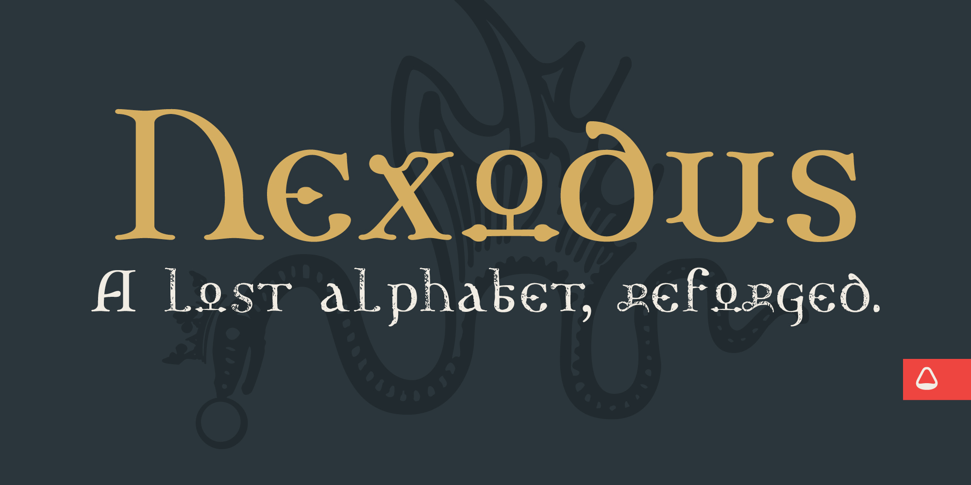
A lost alphabet, reforged.
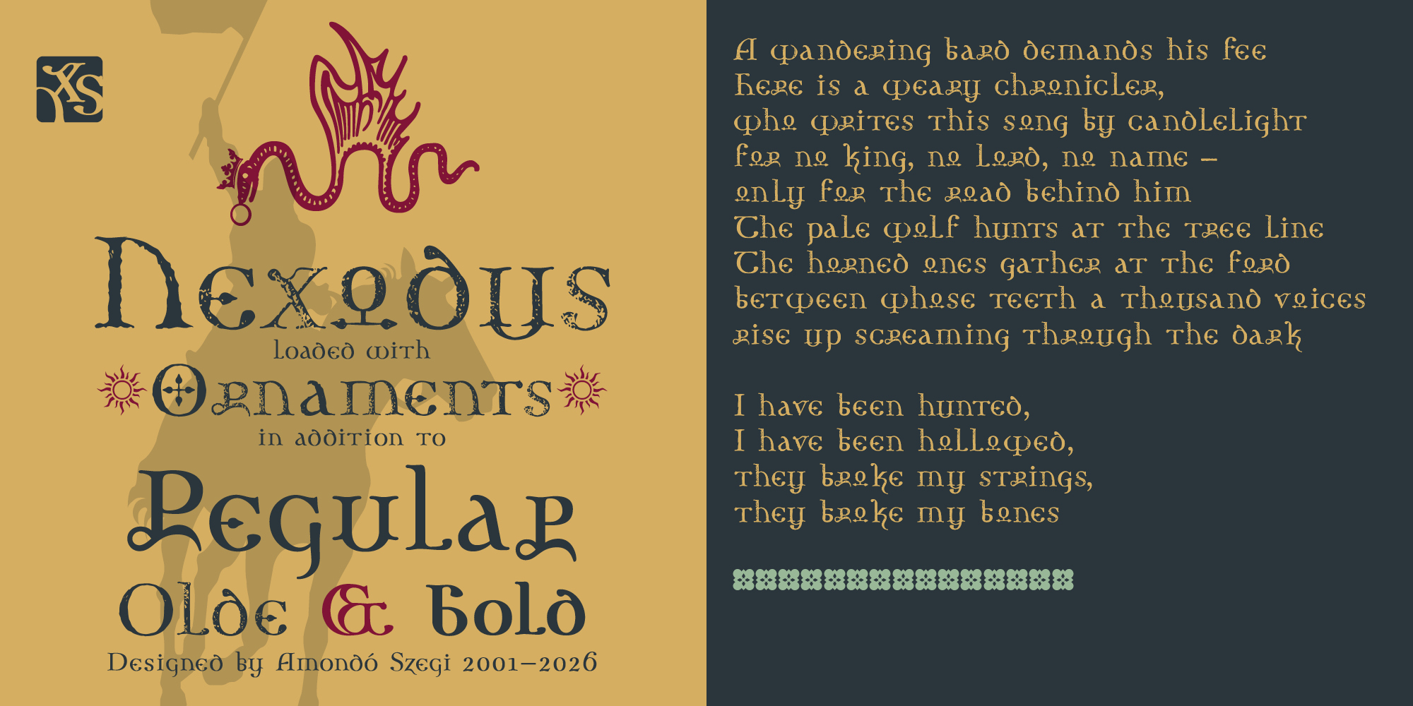
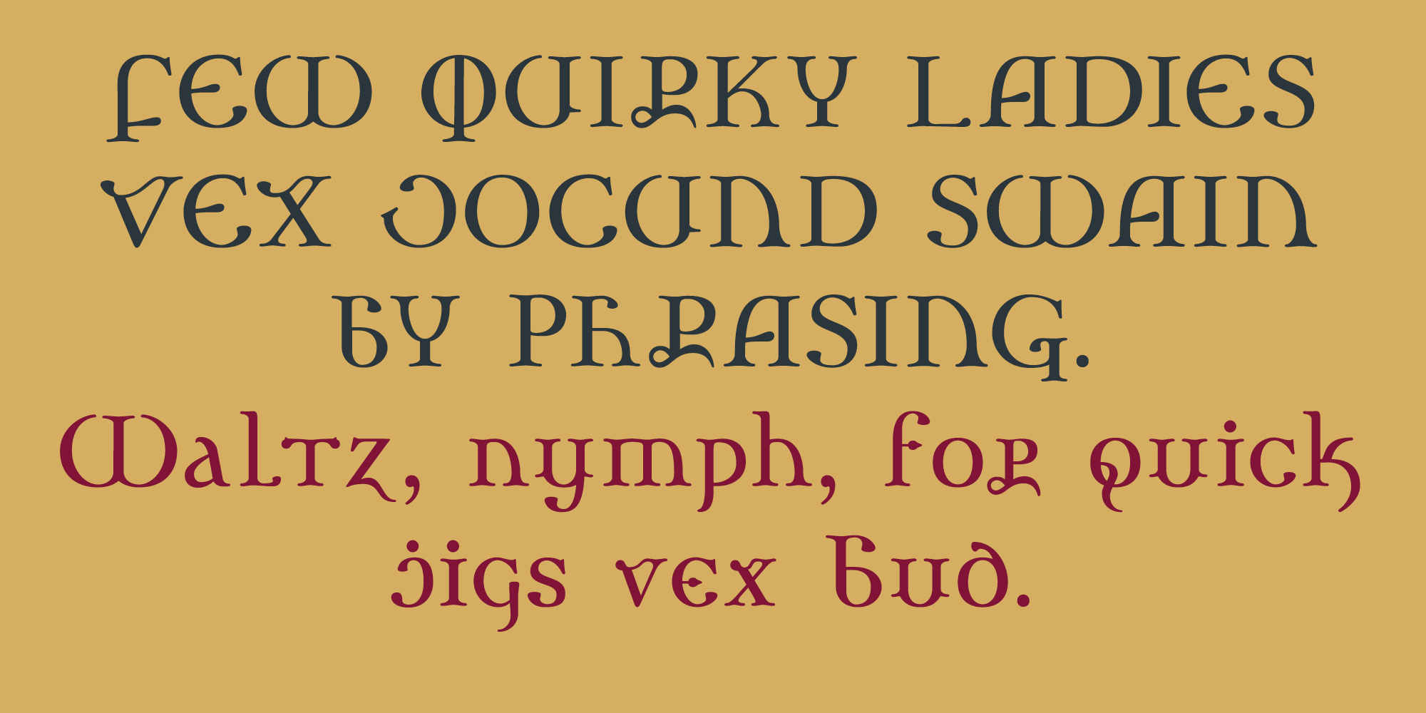
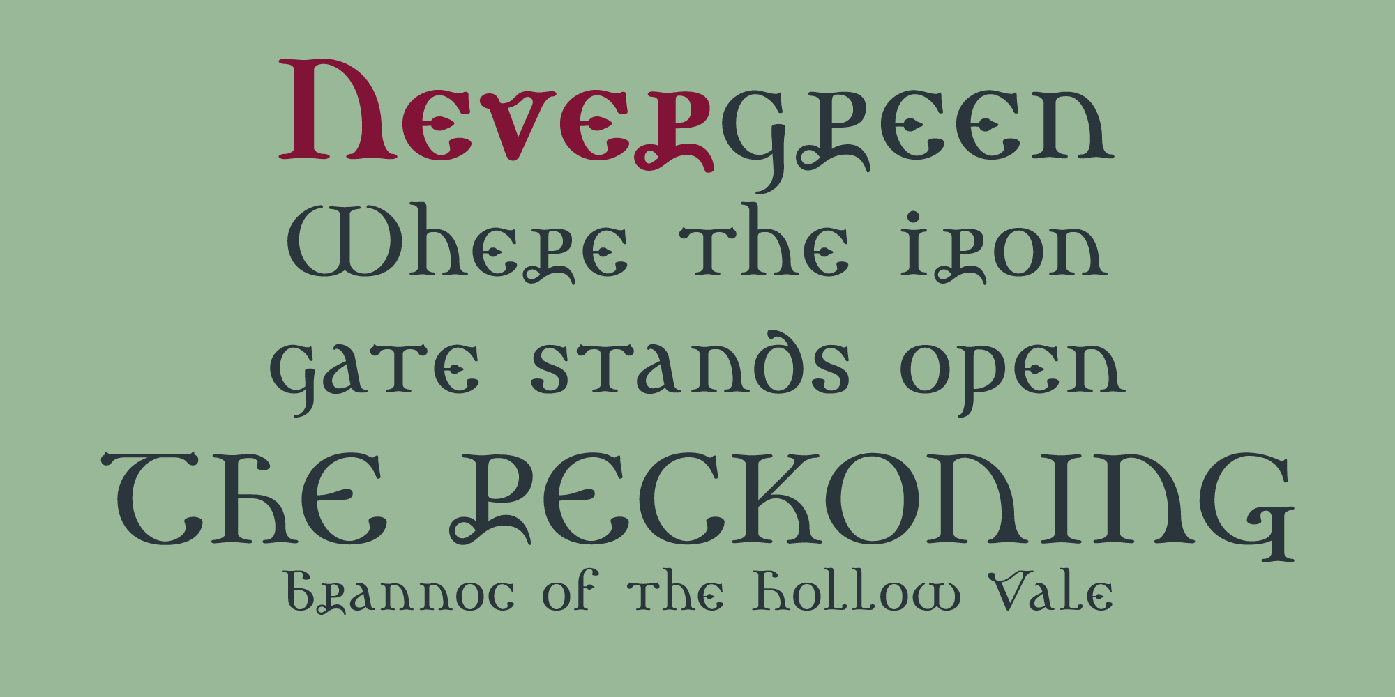
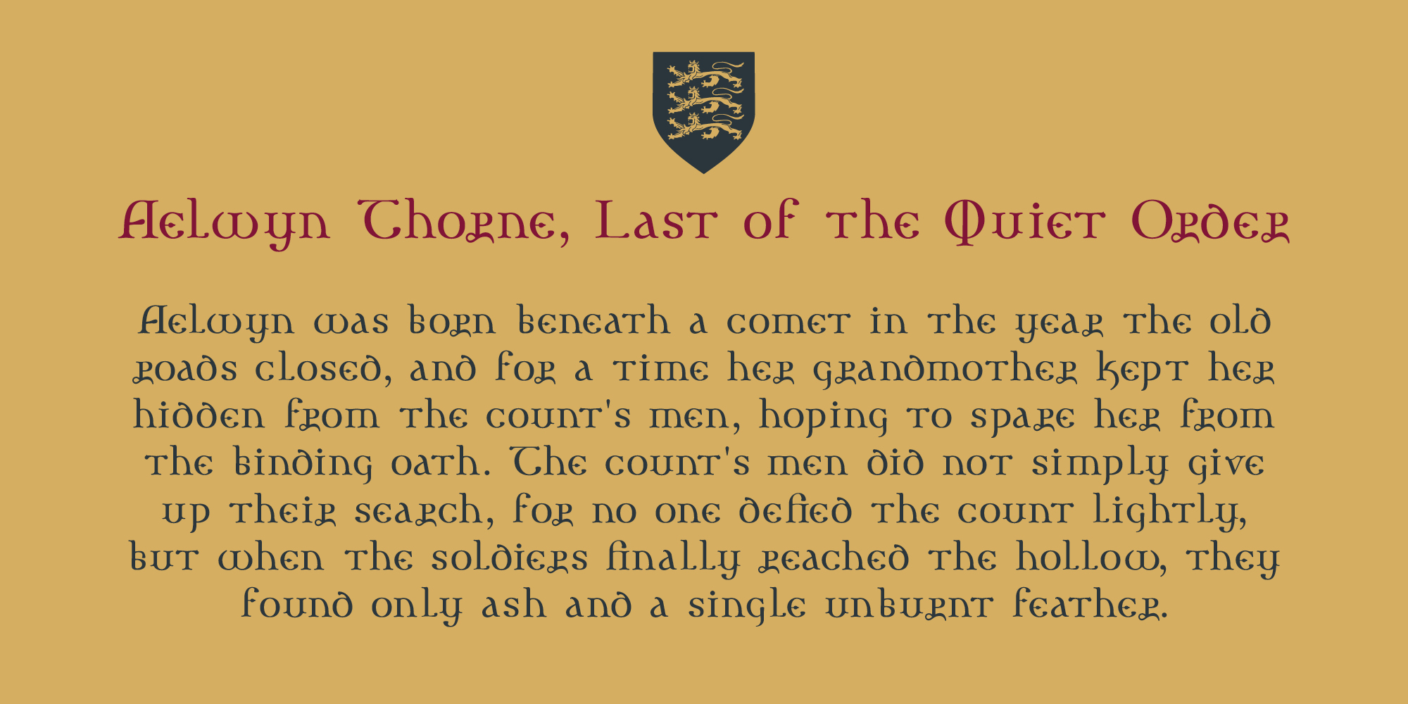
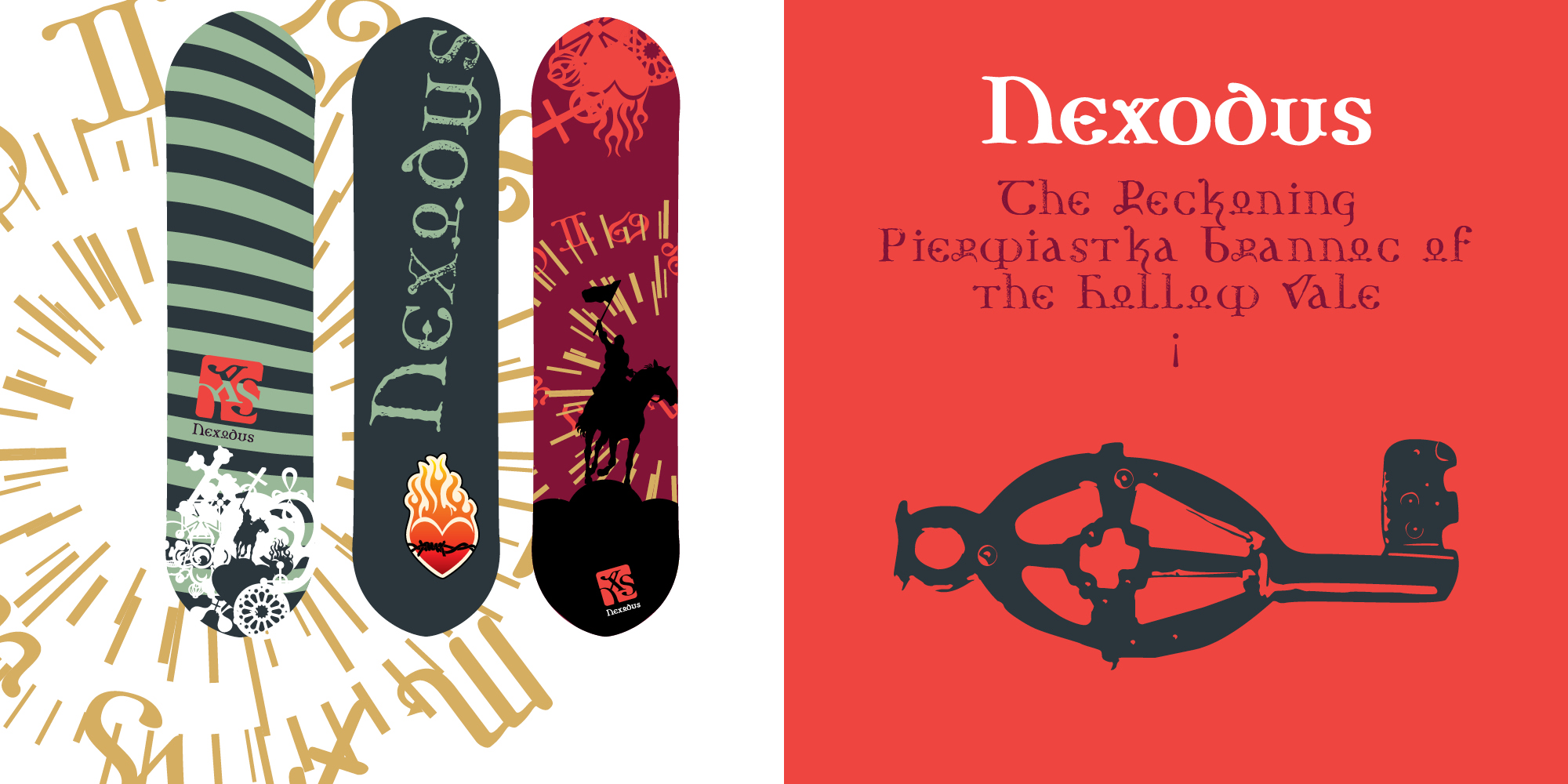
A display typeface equal parts illuminated manuscript and gothic séance — sharp uncial curves, ligatures pulled from old grimoires, and a full Zodiac of glyphs hiding in the alternates. Born for fantasy branding, RPG titles, metal logos, and anything that wants to look like it was found, not designed.
What’s inside
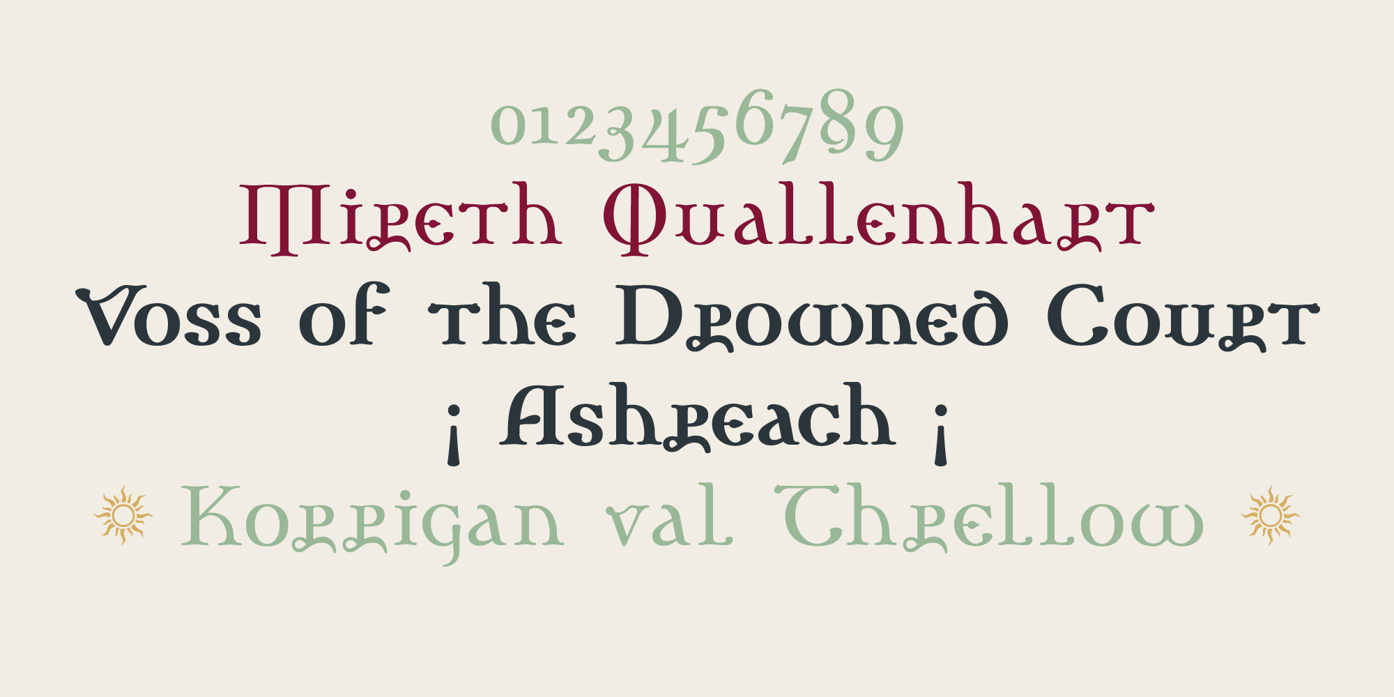
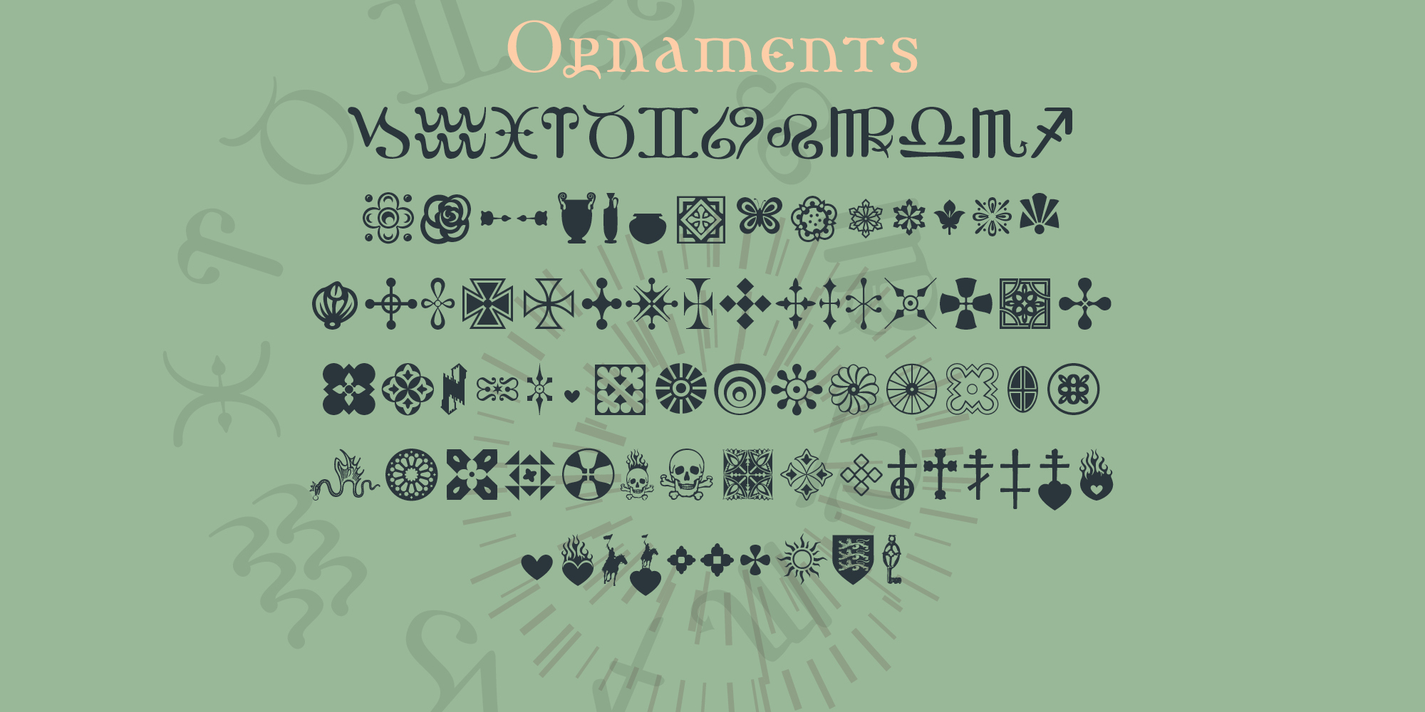
Nexodus comes in Regular, Bold, and Olde — three takes on the same skeleton, from clean display weight to a rougher, manuscript-bred alternate set. Alongside the letterforms sits a dedicated Ornaments family: crosses, rosettes, skulls, zodiac signs, and dingbats enough to fill a margin of any cursed tome.
Twenty-five years after its first cut, Nexodus returns reforged — expanded Ornaments, new ligatures, sharper curves throughout.
The letters behind the letters
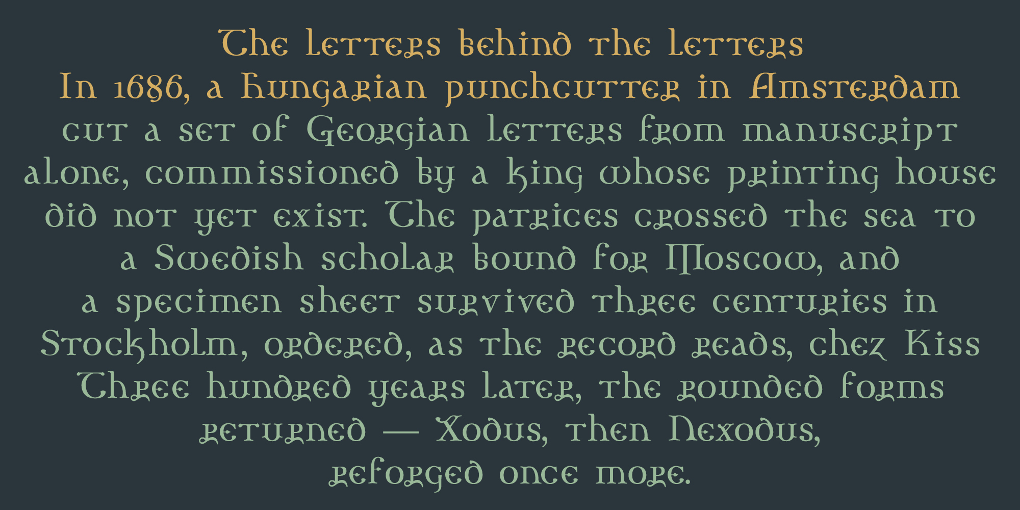
In 1686, the Hungarian punchcutter Miklós Kis — working in Amsterdam, already known for his Armenian types — cut a set of Georgian ecclesiastical letterforms on commission from King Archil of Imereti. Patrices from that work eventually passed into the hands of Johan Gabriel Sparwenfeld, a Swedish diplomat and scholar of Slavic languages with deep ties to Moscow. A 1705 specimen sheet printed in Stockholm — preserved in the Swedish Royal Library — shows three sizes of these Georgian church types, ordered, as the record puts it, “chez Kiss.”
Three centuries later, those rounded, manuscript-born forms became the seed of Xodus (2001, T-26) — later reborn as Nexodus, once named the best Halloween font ever made by HOW magazine. Now, reforged again: expanded Ornaments, new ligatures, sharper curves throughout.
Nexodus
by Amondó Szegi | Debut on T26, 2003 | Published also on Creative Market and MyFonts | 4 fonts, 2 Weights
AaBb12