Lakrits
Done in: 06.2006 | by Amondo Szegi | Customer: Creative Market | 1 weight | $15
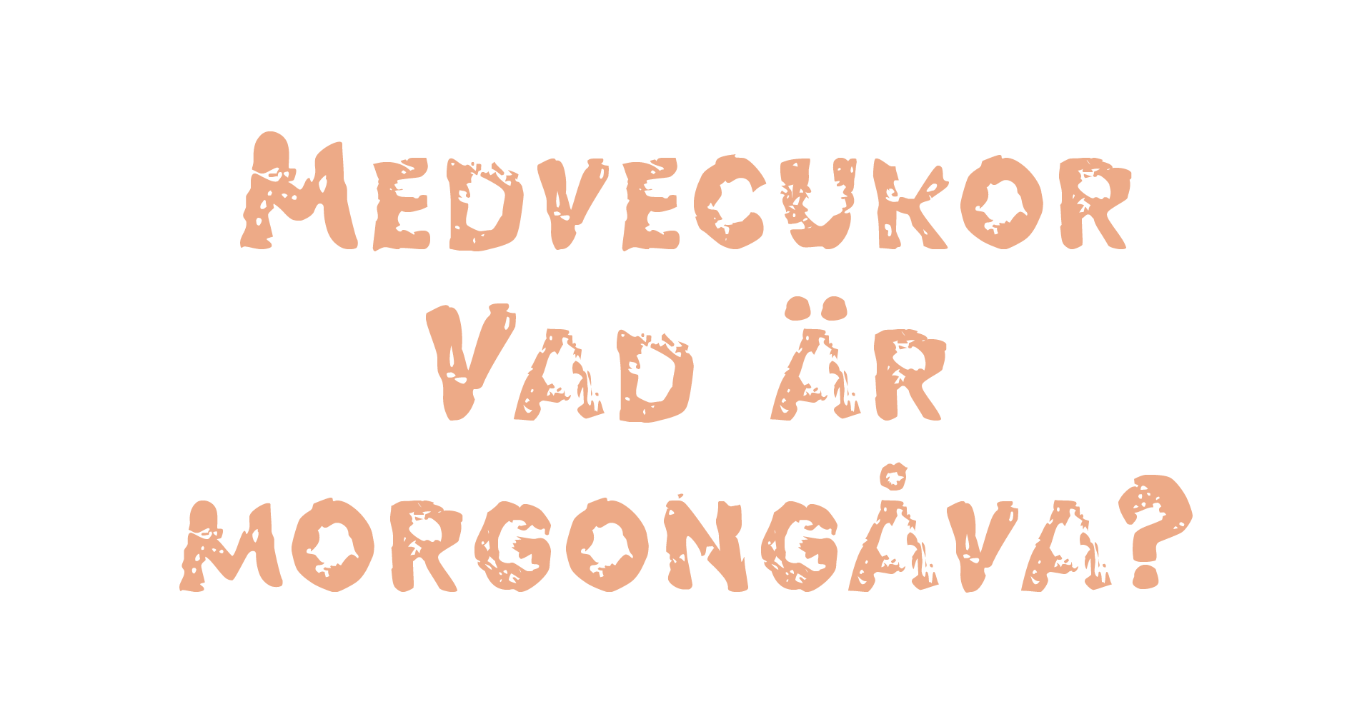
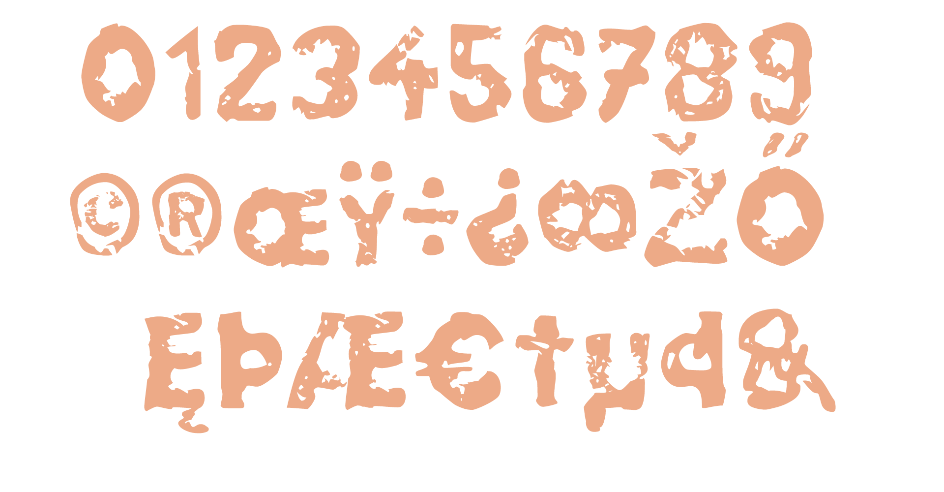
The Lakrits potato print style font is a captivating typeface that captures the essence of both the world of bushcraft and the nostalgia of our childhood. Inspired by the rustic and organic nature of potato printing, this font brings forth a unique and handmade aesthetic that resonates with designers and enthusiasts alike.
The font’s name, Lakrits, draws inspiration from the Swedish word for “licorice,” which is known for its distinctive and irregular shape. Similarly, the Lakrits font embodies a sense of irregularity and imperfection, lending an authentic and tactile feel to any design it graces.
One of the prominent characteristics of the Lakrits font is its resemblance to the mutilated letters found in stencil duplicated samizdat publications. Samizdat, a term originating from the Soviet era, refers to underground literature clandestinely produced and distributed without official approval. The rugged and distorted letterforms of the Lakrits font evoke a rebellious spirit, paying homage to the resilience and resourcefulness of those who dared to share ideas and information against oppressive regimes.
Beyond its historical connotations, the Lakrits font captures the essence of bushcraft, a skillset rooted in nature and survival. The rough and raw textures of the font emulate the marks left by hand-carved wooden tools and the irregular patterns found in wood grain. This evocative style connects with the primal instincts and deep connection to the natural world that bushcraft represents. The Lakrits font has the ability to transport viewers to a realm where they can almost feel the rough bark of trees and hear the crackling of a campfire.
With its nostalgic appeal, the Lakrits typeface also taps into the world of our childhood. It harks back to the days of crafting when we eagerly dipped cut potatoes into paint and pressed them onto paper to create whimsical designs. The font’s irregular and playful letterforms bring forth a sense of innocence and creativity, rekindling memories of carefree days and imaginative adventures.
Designers who embrace the Lakrits font are drawn to its ability to infuse their work with a rustic charm and a touch of rebellion. Whether used in branding, packaging, or editorial design, it adds a unique and memorable element that sets the design apart from the ordinary. Its distinctive appearance captures attention and invites viewers to explore the story behind the typography, making it an ideal choice for projects that seek to evoke emotion and create a lasting impact.
In a world where sleek and standardized digital fonts often dominate, the Lakrits potato print style font serves as a refreshing departure. It celebrates the imperfect beauty of handmade creations, connects us to history and nature, and stirs the nostalgic spirit of childhood wonder. Through its evocative style, the Lakrits font inspires designers to embrace experimentation and break free from the constraints of convention.
on Creative Market


